Diving Into More Dream Stuff
Hey everyone it’s me again! I got some more stuff done this weekend. I started on the battle system, but most of the work I did over the weekend was finishing up the setting. I’ve got a good spot to stop the demo on, so now it’s just fleshing out what I’ve got. This devlog’s gonna have gifs because I feel like it’s extremely warranted for this one.
The past few days was focused on figuring a couple important things out, as well as seeing how far I could push the plugin. The visual settings are gonna be on high for this update unless stated otherwise.
Onto the devlog!
Starting with figuring out a couple essential things that were bugging me that I had glossed over before
The first thing I figured out was distance. I didn’t realize you needed to actually set the distance, and the default is REALLY far away. I think that a distance of 3 works best, but I might fix that up in the future as I fiddle with things. I essentially realized “wait why does setting it to 0 make it first person mode?”
I feel a little silly for taking so long to figure it out, but better late than never. The default distance kept jumping around and it was distracting, especially if you got the camera in a hole and it snapped to show the entire map exterior.
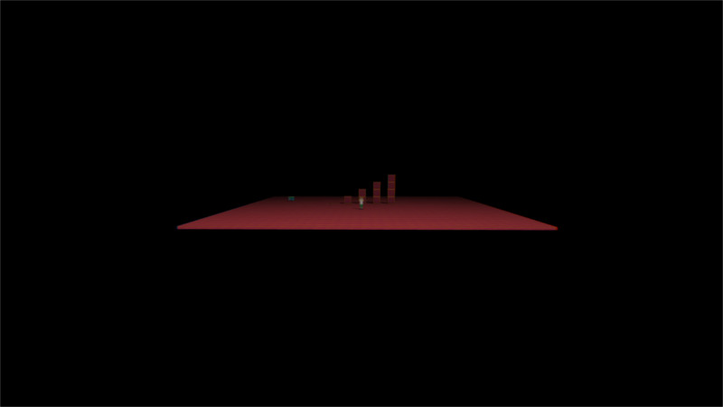
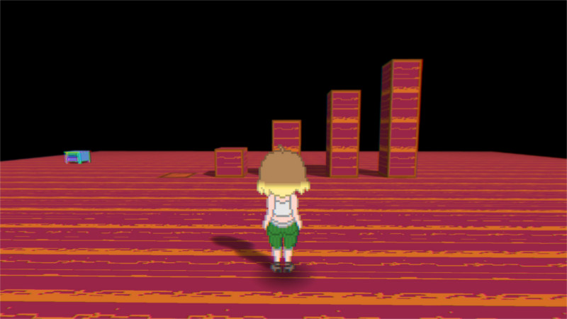 The difference between default distance and a distance value of 3
In other news, I figured out how to do a first person toggle button. It’s currently set to F. I don’t know if I want to keep it stationary or not, but it does add a lot with getting screenshots. It’s also made getting promo images and testing the game a lot smoother for me too.
Onto the lamp height
Looking at the tutorials again, I realized you could set the lamp height to a value. I don’t know why I glossed over it, but it makes stuff look a lot nicer. For example, now you can actually see the blue light coming from the windows. I also have to use a lot less lamp effects this way, so it helps keep things from being too laggy. I don’t know why one of the bulbs isn’t glowing, but I’ll figure it out.
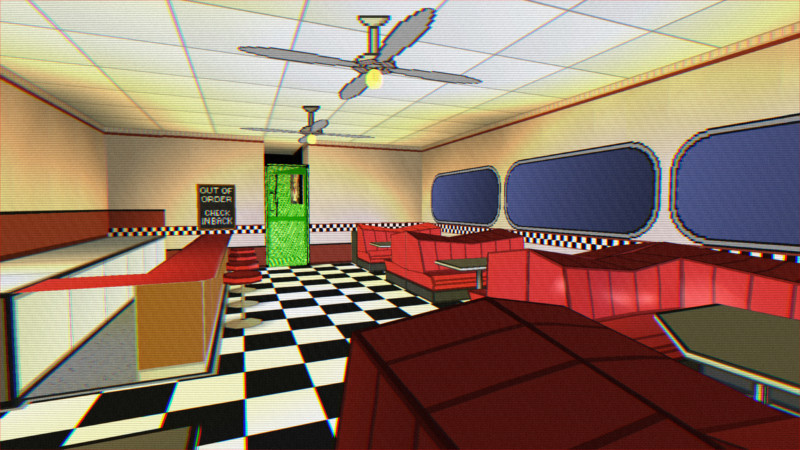
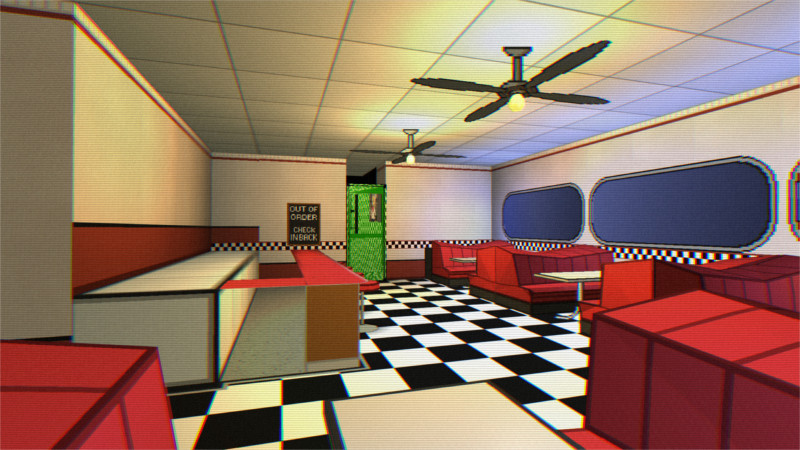
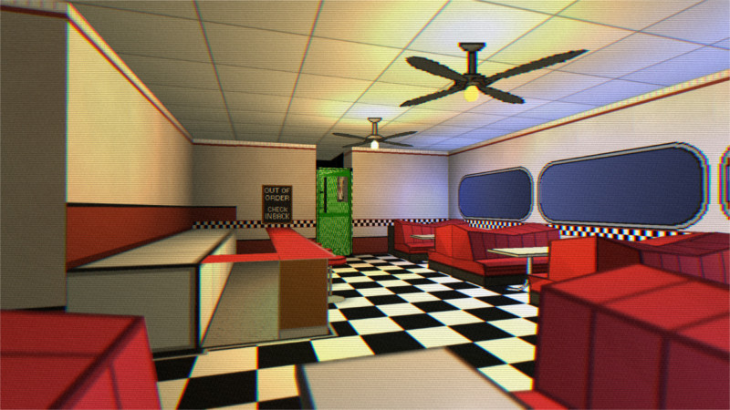 *Diner lighting from the last dev log, current diner lighting, current diner lighting with full effects *
Moving onto the rooms
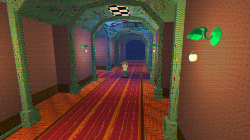 For the area between the different rooms I was torn between a castle and a mansion, but I realized since it’s a dream I could do a mansion for the first half of the game and a castle for the second.
This also helped me realize something else: I could use bigger models.
I couldn’t figure out how to do a sloped ceiling, but since I could import models I decided to just make it in blender. It was originally just gonna be the ceiling, but I figured I’d also do the pillars. The ceiling’s in sections so I could in theory make the map bigger without much issue.
Moving onto the lamps, I made the bulbs float. I looked back at the tutorials to see how to make something levitate. I need to fiddle around with the settings, but it looks really nice.
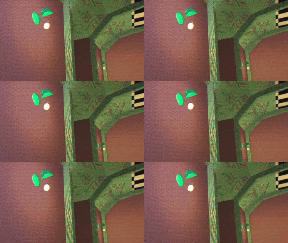
Moving onto Sasha’s room
I decided to work on Sasha’s room some more, and had an idea. Why not make her room the main menu?
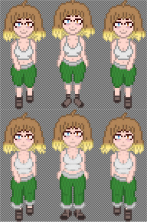
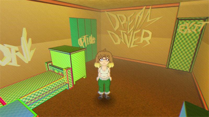 Here you can see a couple things: Fog, and me starting to update Sasha’s sprite. I feel like it looks a lot nicer compared to the initial demo. I need to work on her arms still.
For the room, the words aren’t textured yet and I still have to figure out a consistent style for them, but it looks really cool. Hitting the action button with the exit door does an animation where Sasha walks out the door then the game closes.
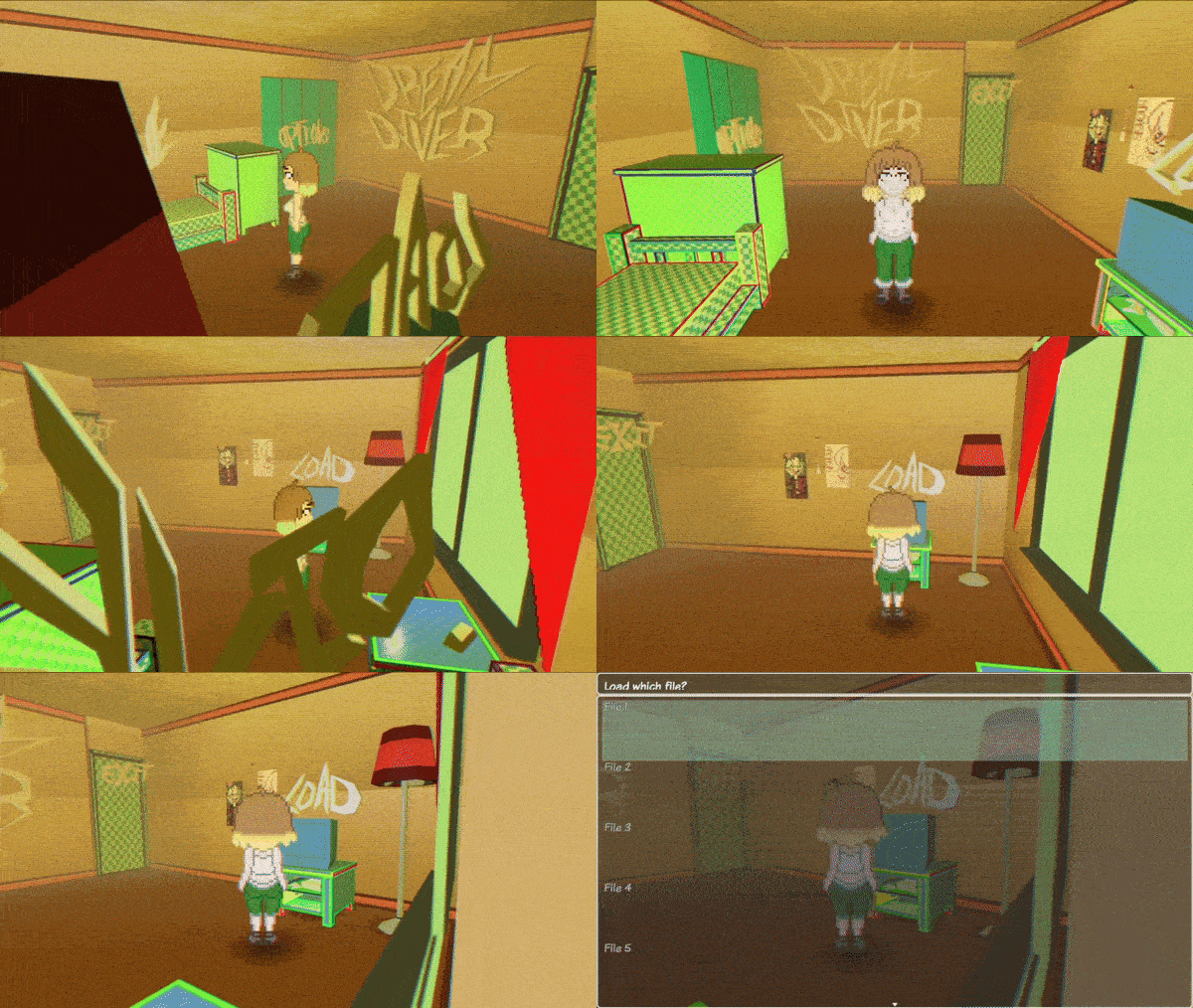
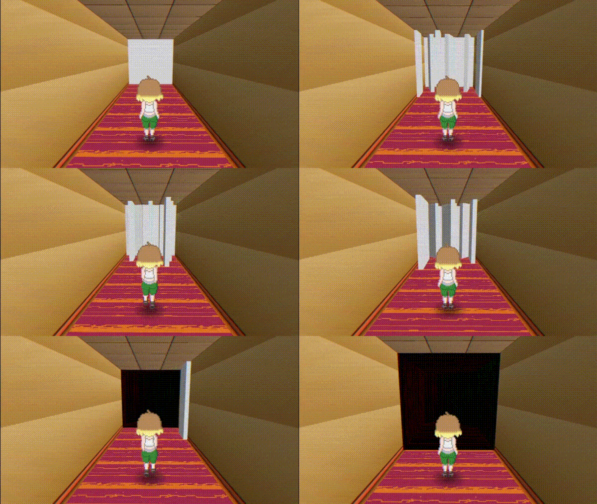
I also wanted to really go into the theme of “this is a dream”
Something cool I did was making it so when you walked close to some walls, they turn to the side and vanish into the nearby walls. I turned the shadows down for this one because the lighting isn’t done yet.
Now onto the main event for this update, the central library room
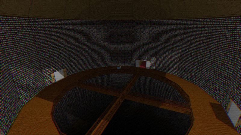
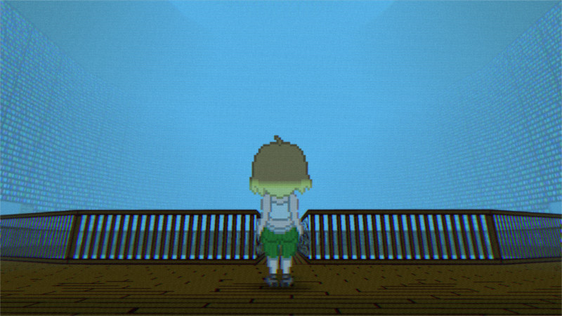 This model is 39x39x60 tiles in rpg maker. It’s massive, but there’s no issues with the 3D plugin rendering it in the engine. There’s only 452 polygons in it, so it’s less than half the size of one of the controllers and smaller than the library lamp lmao
It didn’t take as long to texture as I thought. I split the actual model into multiple sections: 16 for the walls/outer walkway, and 4 for the center walkways, with another for the middle, then a section for the very top and very bottom. The repeating sections’ texture maps are all overlaid on the same part, so that way I could keep the image small (it’s 2048x2048 and 2/3 full, so the biggest texture image lmao) and not spend nearly as long working on it.
The map outside of the hallways on the outside are all invisible tiles, so that’s why you can walk on it. I really feel like I’m pushing the boundaries of what this plugin can do tbh.
The doors are a couple separate models that open up as you finish sections of the library. I’ve got the library wing themes figured out already. I also wanna add a giant stained glass ceiling up top that’s broken with pieces floating in the big open area in the middle, and when you finish the library’s story it gets fixed. I think it’s a good gameplay loop for the worlds that each one has something big that needs to be fixed, also symbolically with the theming.
And now what everyone’s excited about, the battle system
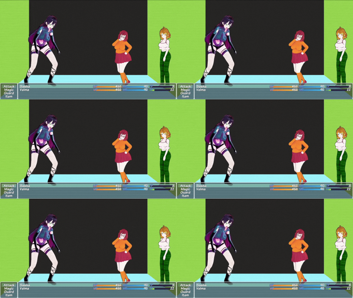 I found out the default RPG Maker battler animation framerate is perfect for the style I’m going for. I wanted it to look sort of choppy like Into the Spiderverse. It’s only 3 frames per animation that get looped, but I think I can 100% work with that.
Unfortunately I’ve gotta nerf Velma for now because all your party members start off more slender but squishy, but like in vale-city they have levels where the bigger they are, the harder they hit.
I’ll probably spend the next few days fleshing out the battle system. I wanna make it feel really punchy and tight. It’s gonna be horny, but I also want it to feel GOOD to do attacks. It’ll come down to timing, so I’ll research some animation stuff, as well as looking at different fighting games’ animations.
I wanna balance making the battles challenging but not frustrating. It’ll be possible to figure out how to grind, but that’d be optional. I want the fights to be engaging, but not super complicated and frustrating.
I feel like I got a lot done over the past few days, and I’m almost done with the actual level designs for now. At this point I’m probably done with the first demo.
Luckily, with this sort of stuff, setting the game up usually takes the longest, so updates after this probably will be quicker, especially since they’re gonna be mostly focused on fleshing out the library and extending the story to the end of the library.
For the textures, they’ll probably just be flat in the first updated release, because I made a LOT more models than I thought I was going to. Hopefully I’ll have the demo out in the next few weeks, but I feel really proud of how much I’ve done so far.
Hopefully on Friday I’ll have the battle system figured out and some more texturing done, see you then!
Get Dream Diver
Dream Diver
An Adventure In The Mind Of A Troubled Woman
| Status | In development |
| Author | dessychan |
| Genre | Role Playing |
| Tags | Adult, NSFW, vore, weight-gain, Yuri |
| Languages | English |
More posts
- 0.1 Is Finally OutNov 21, 2024
- Last Devlog For NowNov 16, 2024
- Getting Back Into It, Almost DoneNov 13, 2024
- No Dev Log TodayNov 09, 2024
- Almost Done For NowNov 05, 2024
- No Big Devlog TodayNov 02, 2024
- The Final StretchOct 29, 2024
- Getting Into The Home StretchOct 25, 2024
- Approaching The Finish LineOct 23, 2024
- No Big Dev Log Today, Just Some IdeasOct 18, 2024
Comments
Log in with itch.io to leave a comment.
this is actually promising :D
Can't wait.