Figuring Out The Battle System & More Texturing Done
Most of the past few days was spent figuring out the battle animations and fixing the textures to have a more consistent visual style. I did make a couple extra models as well. It’s gonna be a shorter devlog because I got less things done, but said things took more time.
Onto the battle system! The very first thing I wanted to do before anything was fix Velma’s model so she looks closer to the show, also accounting for the way I’m rendering stuff as well because the visual effects I’m doing makes the colors all saturated. She looks really cute.
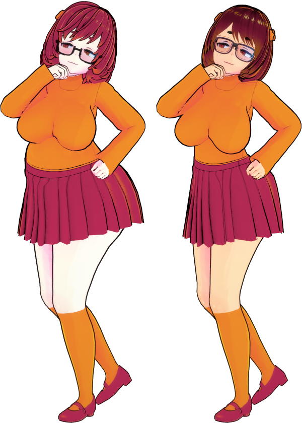
Next I did an idle animation for her and made sure it was done so I could learn the general process for the 3 frame animations. Originally I was thinking of learning to animate in Koikatsu and take a frame from the middle, but I think it’d be more in line with the style if I hand animated each frame. There’s only 3 per animation so it’s not that tedious. I pretty much made sure her legs were good, then animated the rest of her starting from the skirt up.
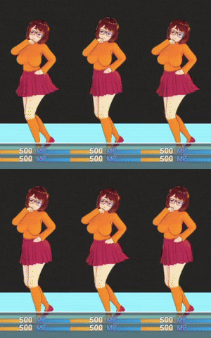
After this I wanted to start doing rough drafts for the attack animations. First one was her ass attack. I was inspired by fighting moves where the character hits with their ass lmfao. I also wanted to make it more cartoony, so she flies back and stumbles to get her footing back. I think it’s really cute. I think eventually I’ll have it to where there’s a small chance that her missing leads to her getting swallowed for a turn or two.
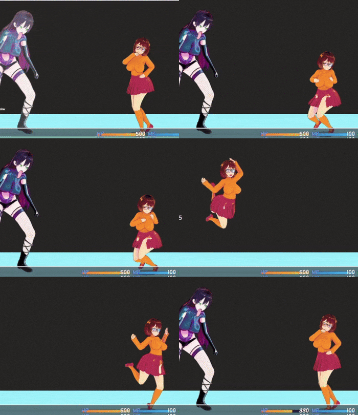
After this I wanted to make an “attack” for Sasha where she misses and falls on her face, and it takes a bit to recover. This is to emphasize that she’s a support unit and can’t attack, showcasing how she feels powerless in her own head. It starts with her preparing, then a swing and a miss, then stumbling to get up and fidgeting for a bit. Also yeah that’s the Family Guy death pose lmao.
The numbers / colors are for me to see what part of the battler sheet I’m working with.
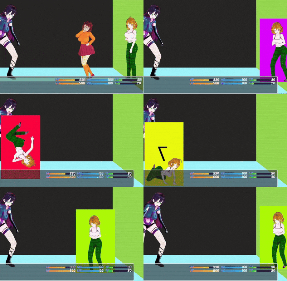
Here it is slowed down so you can see the frames better.

This part of the animation ended up being pretty good for a low HP animation.

Rounding off this section I made a short use item animation for her. Full speed and slowed down.

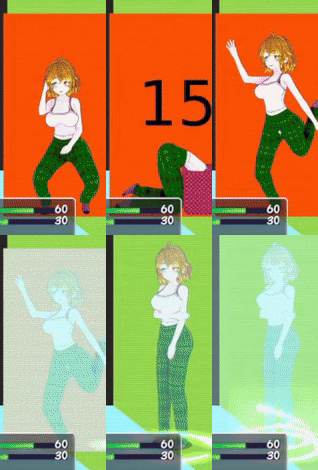
In the future I’ll probably use ren’py for testing out the animations, because opening rpg maker and initiating a battle just to see if an animation looks good takes a long time if I’m doing a bunch of little alterations.
Also, after this release I’ll probably figure out how to use Dragonbones for the fighting animations, cause I’ll be able to adjust the timing and how many frames I can use for a single animation. I think doing that will make combat feel way better.
Onto the texture fixes
I wanted to start with Sasha’s room. Lighting’s off for these screenshots, but I got a lot done.
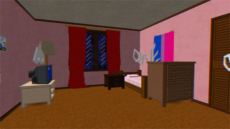
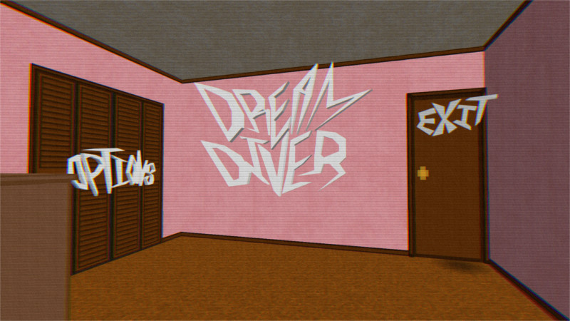
I ended up settling on a darker wood for the doors / molding, then I wanted her walls to be a soft pink. I feel like it contrasts extremely well. I also wanted to make the majority of the color scheme for her room be some sort of brown or pink. I think making all the wood furniture a different type of wood also is a nice touch tbh.
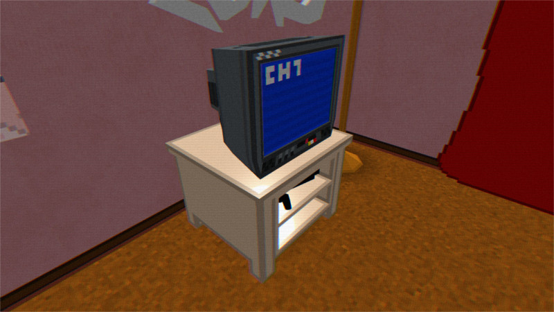
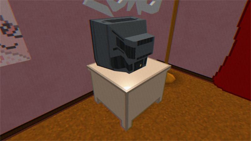
Something I feel really proud of is the CRT model’s texture. I ended up going for vertical lines instead of horizontal lines for the vents, and I think the texture warping makes it look really cool.
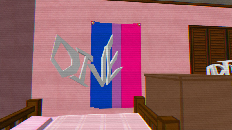
I also added a bisexual flag above Sasha’s bed cause it’s my game so I can showcase she’s bi if I want to. I also wanted it to actually have stitching you can see if you look close enough.
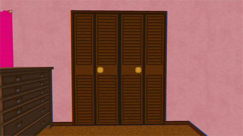
For Sasha’s closet, I wanted to give her a bifold closet. It feels more visually interesting than just another door, and it also signals to the player that it’s different than her bedroom door.
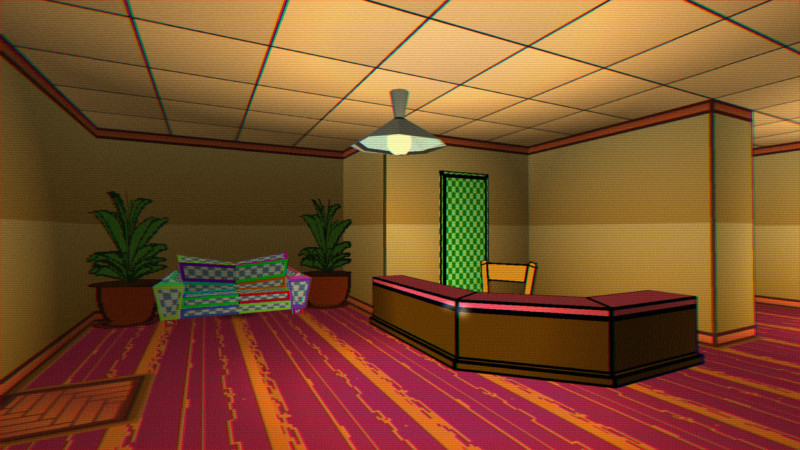
Onto the library For the library, I ended up doing a 60’s/70’s style wall paneling. I might mess around with the colors a little more, but I feel like it meshes really well with the visual style I’ve got for everything else in the library. It was originally just gonna be a flat texture with some HSV noise, but it ended up being a confusing mess to look at. The vertical lines help a lot with fixing that issue.
I started doing a guide for myself to consistently texture stuff. It’s essentially that most stuff is at 100% saturation with either 50%, 70%, or 90% brightness. The lines are the same color but at 10% brightness, so they’re not straight black and they mesh well with the main color. The walls are textured slightly different so they don’t make stuff too visually confusing by having everything textured the same.
I feel like I’m starting to get a hang of the visual style I’m trying to go for here tbh.
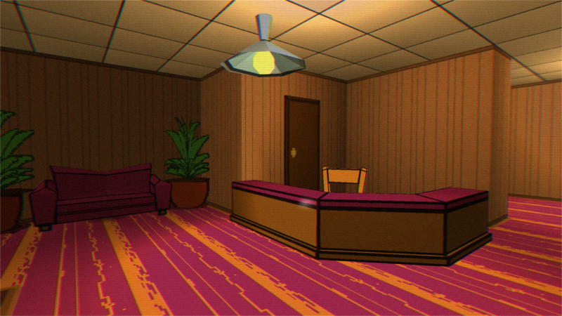
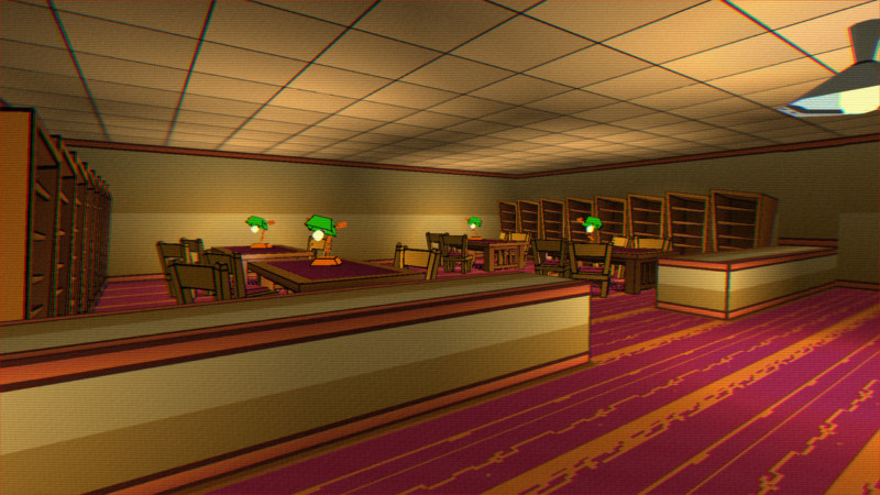
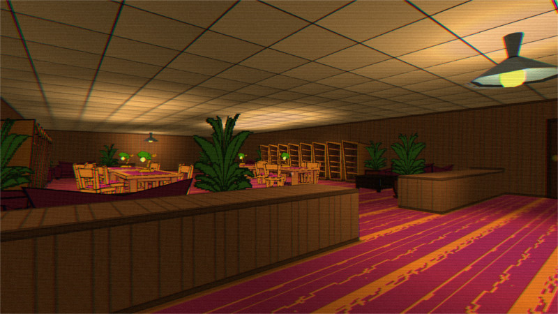
The last thing I did I started this morning I had an idea where for boss battles, there’s a pre battle phase where you’re dodging attacks on the map. I feel like it’d make boss battles more interesting and differentiate them from the standard rpg battles.
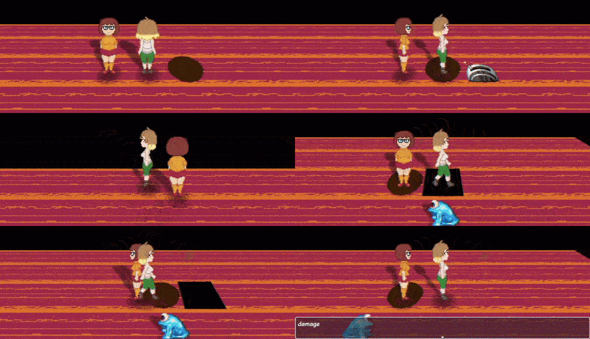
I feel like I’m closing in on finishing up the initial updated demo. In other news I have the actual ending figured out. I’m not gonna spoil it, but I feel like it’s really good. Over the next few days I’m probably gonna work on drafting out the rest of the battle animations, and starting to finalize them. I also wanna work on finishing up texture mapping and texturing the models.
Get Dream Diver
Dream Diver
An Adventure In The Mind Of A Troubled Woman
| Status | In development |
| Author | dessychan |
| Genre | Role Playing |
| Tags | Adult, NSFW, vore, weight-gain, Yuri |
| Languages | English |
More posts
- 0.1 Is Finally OutNov 21, 2024
- Last Devlog For NowNov 16, 2024
- Getting Back Into It, Almost DoneNov 13, 2024
- No Dev Log TodayNov 09, 2024
- Almost Done For NowNov 05, 2024
- No Big Devlog TodayNov 02, 2024
- The Final StretchOct 29, 2024
- Getting Into The Home StretchOct 25, 2024
- Approaching The Finish LineOct 23, 2024
- No Big Dev Log Today, Just Some IdeasOct 18, 2024
Leave a comment
Log in with itch.io to leave a comment.